I Created a Fictional Tea Brand and Tested ChatGPT Images 2.0 on 9 Use Cases. Here's What It Produced.
- Pritam Sharma
- Apr 28
- 5 min read

Every AI image tool review I have read uses either stock photos or famous brands as the test subject. That makes sense for consistency, but it also means the tool has probably encountered that exact product thousands of times in training. I wanted to test something it had never seen. So I made one up.
The Setup
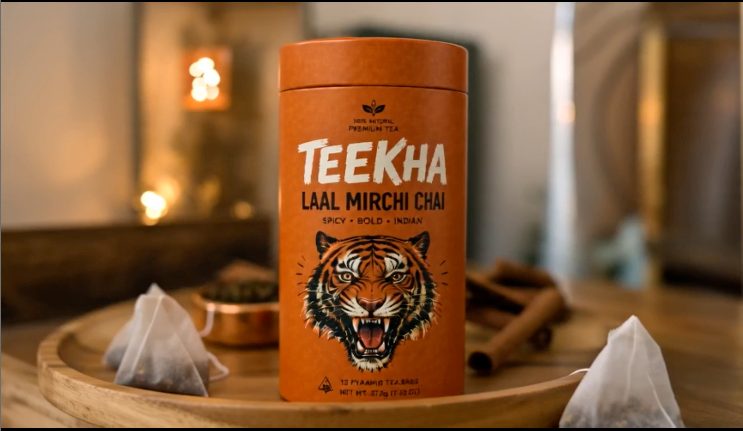
TEEKHA is a fictional Indian D2C chai brand I built purely as a testing subject for this experiment. Saffron orange and forest green brand colors, a roaring tiger logo, three products (Laal Mirchi Chai at Rs.349, Adrak Tulsi Chai at Rs.299, and Kesar Elaichi Chai at Rs.499), and a Hindi tagline: Ek Sip. Poora Dhamaka.

The tool was ChatGPT Images 2.0, OpenAI's most recent image generation model, released in April 2026. It introduces a Thinking mode that allows the model to reason and search the web before generating, improved text rendering across Latin and non-Latin scripts including Hindi, and the ability to generate up to eight images from a single prompt in Thinking mode. I ran all tests on the Go plan, which includes Thinking mode access.
The Prompts
Each test used a single prompt unless a follow-up edit was part of the test itself. I did not use pre-written templates. Prompts were typed directly into ChatGPT's image interface in one session.
The product photography prompt was: "Create a premium product photography shot of a kraft paper cylindrical tea tin called 'TEEKHA, Laal Mirchi Chai'. The tin is bold saffron orange with a roaring tiger illustration and chunky hand-drawn typography. Background is a dark green marble surface with scattered red chillies and cardamom pods. Dramatic moody lighting. Ultra-realistic, commercial grade."

The background swap prompt was: "Keep the TEEKHA tea tin exactly as it is, same label, same colors, same logo. Change only the background to a busy Mumbai street at golden hour, bokeh effect. Tin stays in sharp focus."
The pitch deck prompt was: "I've uploaded a brand guidelines document for TEEKHA, a bold Indian masala chai brand. Using the brand identity in this document, generate a 6-slide investor pitch deck. Match our brand colors and visual identity throughout."
What Happened
Product photography and background editing. The first output matched the prompt closely. The tin sat on dark green marble with chillies and cardamom visible, the lighting was moody, and the quality looked like something from a D2C product launch campaign. The background swap kept the tin intact across three follow-up tests: Mumbai street at golden hour, Bangalore street, and a 16:9 reformatting for a YouTube banner. The label, tiger, and colors stayed untouched in each case.


The logo and 90s Bollywood poster. The logo prompt asked for 90s Bollywood movie poster meets Mumbai street art. What came back had a roaring tiger, chunky TEEKHA lettering, and Hindi text the model added without being asked: tez, tagde, desi. All of it accurate and legible. The bilingual advertising poster had both English and Hindi headlines, decorative Bollywood-style borders, and a layered visual density that accurately reflects Indian print advertising from the 90s. Previous models have produced Hindi text as stylistic decoration rather than actual readable language. This one got it right.


The app UI. A single prompt asked for a mobile e-commerce home screen showing all three TEEKHA products in a carousel, a Best Sellers section below, and the saffron and green color scheme. What came back also included a bottom banner reading "Chai Jo Jagaye," which was not in the prompt. The follow-up for a product detail page produced Laal Mirchi Chai at Rs.349, a 4.8 star rating with 1,286 reviews, flavor notes with corresponding icons, and a complete Add to Cart layout. The UI was coherent and readable on the first attempt.


The 6-panel storyboard. A single prompt described a 30-second TV commercial: tired office worker at 3pm, colleague places TEEKHA chai on the desk, first sip, transformation, typing furiously, logo full frame with tagline. The output included scene descriptions and director notes below each panel. Visual consistency between panels was acceptable but not perfect. The character looked slightly different across some scenes.

The infographic. With Thinking mode on, the model generated an infographic titled "India's Chai Culture by the Numbers" covering daily consumption figures, top producing states, popular spices and their health benefits, chai consumption by time of day, and a price comparison from tapri to five-star hotel. All rendered in TEEKHA brand colors. The visual was sharp and the text was readable throughout.

The pitch deck. I built a 4-page TEEKHA brand guidelines document covering brand identity, color palette, all three products, tone of voice, and target audience, then uploaded it as a PDF with Thinking mode on. The model thought for 2 minutes and 1 second. The output was a 6-slide investor pitch deck that cited Reuters, Statista, and the Tea Board of India for the market opportunity slide, pulled the saffron and green palette directly from the uploaded document, and matched the brand tone across all slides. The research was legitimate. The slide layout was not.

The Canva integration. Using the Canva connector inside ChatGPT, I requested 4 editable Instagram post templates in the TEEKHA brand style. Four template options were generated and made editable inside Canva directly, following the same connector workflow documented in last week's post on Claude Cowork.

Honest Assessment
What worked well. Product photography, background editing, and the app UI were the strongest outputs. The level of detail in the app screen was higher than I expected: prices displayed in rupees, the unprompted "Chai Jo Jagaye" banner, flavor note icons that matched the product description. None of this was spelled out in the prompt.
The Indian cultural context accuracy was the most significant finding. Bollywood aesthetic, Hindi typography, bilingual advertising formats, the specific over-designed layered energy of 90s Indian print ads: none of these needed explicit explanation in the prompt. The model understood what they should look like and produced them correctly.
What needs work. The pitch deck slide layout is not production-ready. The structure is logical and the market research is sourced, but the visual design of the slides needs a full redesign before going to anyone. Character consistency across storyboard panels is imperfect. The infographic numbers look plausible but need independent verification before going anywhere public. The model generates statistical claims with the same confidence regardless of accuracy, so human review of any fact-heavy output is not negotiable.
What it does not do. It does not flag uncertain information or suggest that you verify anything. That responsibility stays entirely with the person using it.
What This Changes
The clearest shift is in early-stage creative validation. Watching a fictional brand go from a name and a color palette to product photography, a mobile app UI, a bilingual advertising poster, and a sourced investor pitch deck in a single session changes what is feasible before any real investment in design or production. For a solo founder or a small team, the gap between idea and looks like a real brand is now meaningfully shorter.
The catch is that shorter does not mean finished. Every output in this session required human judgment before it could go anywhere real. The infographic needs fact-checking. The pitch deck needs redesigning. The storyboard needs animating.


Comments